A breadcrumb trail (or just ‘breadcrumbs,’ named after a maneuver from a fairy tale) is a secondary navigation in user interfaces that helps users track their location within a program or website. Initially, it appeared in software user interfaces, but now it is more commonly used on modern websites, mainly as a path from the main page, though sometimes for other user navigation tasks as well. Typically, this navigation element is positioned at the top of the page, occupying minimal space without distracting the user.

Ikea’s website is a perfect example of using breadcrumb navigation.
Proper use of such navigation positively impacts user experience, but more importantly, when used correctly, breadcrumb navigation significantly affects the website’s SEO by enhancing user experience and improving internal linking.
Breadcrumbs navigation can be static (it remains the same for all page visitors) and dynamic, where it varies depending on the user’s navigation history. Dynamic navigation is handy for complex applications but rarely as effective on websites. Moreover, dynamic navigation is not beneficial for SEO. Poorly integrated, it can even worsen SEO performance, as there will be different paths every time the crawler accesses the page.
One common approach that e-commerce sites implement is to show a static version to users without browsing history and a dynamic version if the user arrives, for example, from the site’s search.

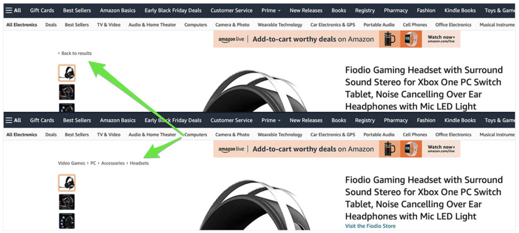
Amazon shows breadcrumbs for visitors from categories and a link for visitors from the search.
Breadcrumbs for static navigation can be categorized as follows:
- Location-based or Hierarchy-based: Indicate a page’s position within the website’s structure.
- Attribute-based: Focus on specific product attributes.
- Task-based: Guide the user through a specific task with several steps, such as completing an e-commerce order or booking a car rental.
Task-based navigation is unrelated to SEO so that we will focus on the first two categories.
Hierarchy-based breadcrumbs benefit visitors by simplifying browsing. They help users understand their path and decide where to go next. This navigation provides one-click access to higher-level pages and related content, leading to more page views. This change in visitor behavior helps reduce the website’s bounce rate.
Attribute-based breadcrumbs display product or service attributes, allowing visitors to access pages with similar offerings quickly. They are mainly used on eCommerce websites to enhance user engagement by offering similar or related products, which promotes upselling and cross-selling.
Both categories of ‘breadcrumbs’ enhance usability, making it easier for visitors to navigate different pages and complete tasks efficiently.
Sometimes, there can be more than one breadcrumb trail when visitors can access the content in several ways. However, this makes navigation harder. If you plan to use multiple breadcrumb trails, it is crucial to either separate them on the page based on user group targeting or integrate them seamlessly and perform A/B tests.
Why are «Breadcrumbs» good for SEO?
They improve user experience and make navigation SEO friendly.
Firstly, having breadcrumbs helps improve the user experience on the website. Visitors from search results spend more time on a website, which signals to search engines that the website is relevant to the submitted query. Search Engines track the behavior of users visiting the pages in search results. For example, if the visitor quickly returns to the search engine, it is evident that the visited website didn’t meet his experience. The parameter that counts this is called Bounce rate. Having a low bounce rate helps to get better rankings. Breadcrumbs may catch the uncertain visitor’s attention and give a better understanding of what your website offers. As a result, bounce rate will decrease.

Miele uses breadcramps on their content website to intrigue and engage visitors
Secondly, it improves internal SEO. Links make it straightforward for Search Engines to understand the website’s hierarchy and how its pages are linked (especially, if you use Structured Data format markup). Also breadcrumbs contain backlinks with target keywords pointed into specific pages, significantly improving internal linking.

Google shows breadcrumbs in Search Results
To conclude, breadcrumbs are important for SEO because they enhance site navigation, improve user experience, and provide search engines with clear hierarchical structure, aiding in better indexing and ranking. However, this only works with proper navigation implementation.
How to create breadcrumbs navigation with maximum efficiency?
The essential point is that breadcrumbs should not replace but extend the main website navigation. They should start from the main page, and the level hierarchy should be clear. The separator should be plain and short. The anchor links should be straightforward — if they are too long or repetitive, shorten them. There should not be an active hyperlink to the current page in breadcrumbs; self-linking is a bad practice.
Location-based breadcrumbs must clarify the order of the hierarchy, so links to pages on the same level should not be present. Navigation should include all levels from the current page to the home page.
For Attribute-based navigation – if there are too many visible levels, you may want to limit the number of visible levels to keep the navigation simple.
The breadcrumbs style should suit the website’s appearance; the font and color should not distract visitors. However, they should be clearly visible and clickable.
When should you avoid «Breadcrumbs»?
Сonsidering all of the above, it is hard to reject using breadcrumbs; however, SEO improvements are just an additional benefit; the primary purpose of the breadcrumbs is to improve website usability and enrich user experience. Therefore, in some cases, it is better to not have breadcrumbs and to improve the website first.
For example, if the website has just a few pages, breadcrumbs are unnecessary. Nevertheless, if there are many pages, but all of them are on the same level, breadcrumbs would also be useless. In such cases, it is better to form one more level of content and create various pages to fill it.
Breadcrumbs should not be used as headings, nor should heading tags be used to stuff backlinks, because this practice confuses the semantic structure of the page, making it harder for search engines and screen readers to interpret content correctly. It negatively impacts accessibility for visually impaired users and dilutes the SEO value of headings, potentially harming search rankings.
Breadcrumbs Examples: Good and Bad practices

The website of this Arizona company exemplifies poor practices. The breadcrumbs are completely ineffective because they fail to display the site’s hierarchy, which is nonexistent. Instead, the company should create a dedicated page listing their services, with detailed pages for each one.

Many business websites have standard pages such as “Contact Us,” “About Us,” and “Careers,” typically grouped in the “About Us” section. Breadcrumb navigation is usually unnecessary for these pages since they are on the same first level. However, if subpages are in the hierarchy, breadcrumbs can be used without including “About Us” in the path .
Bad: Home → About Us → Careers
Acceptable: Home → Careers
Best: Home → Careers → Jobs in Seattle

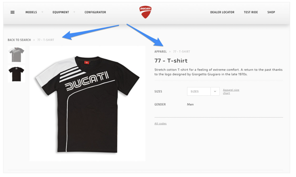
The Ducati website uses both location- and history-based breadcrumbs, but the number of hierarchy levels is too low. The “T-shirts” category seems to be missing from the path.

On the Farfetch website the primary navigation and breadcrumbs share almost the same style. It is better to use different fonts and colors. Additionally, clicking “Bomber jackets” returns the visitor to the same page, which is a poor practice.

Asos employs both location-based and history-based breadcrumbs. Sometimes, there is no path between the home and product pages. If history data is absent, the navigation should show the default location-based breadcrumb.

Cutipol has well-designed breadcrumbs, but the product link remains active and simply reloads the page when clicked.

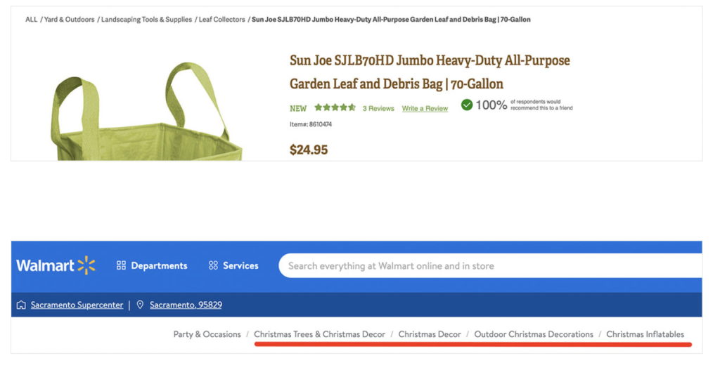
The breadcrumbs on The Gardeners and Walmart websites are too wordy because they use the default category and product names. It is better to shorten navigation link anchors if possible, though this may need to be tested for conversion rates on eCommerce websites.

The Gov.uk website does not include the current location in the breadcrumb trail, making it less informative. When visitors land on this page, they will not understand that clicking “Foreign Travel Advice” will bring them to the list of countries.

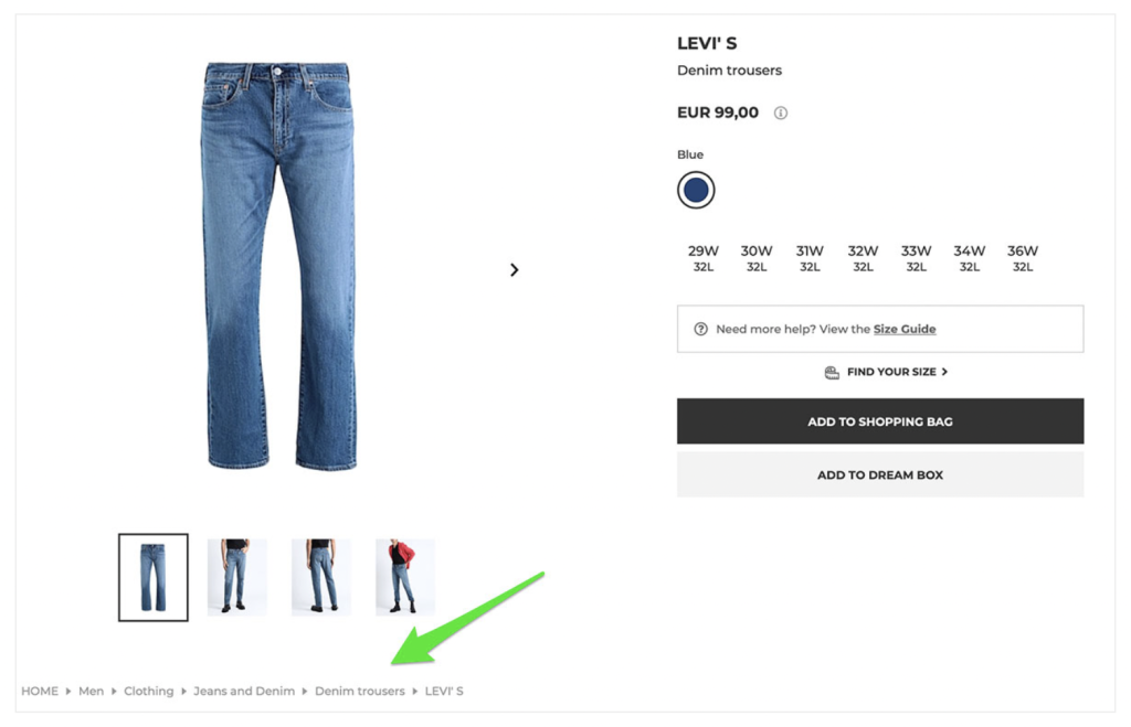
For some reason, the YOOX website’s navigation is not at the top of the page. However, it perfectly combines hierarchy-based and attribute-based breadcrumbs, using categories as the path and the brand name as the attribute for the last element. Even casual visitors understand that clicking on it will bring them to the page with all LEVI’s jeans.

Target uses only location-based breadcrumbs but provides a separate link to the brand page, allowing the visitor to decide where to go next.

This bank website uses a custom link anchor (“Car Finance” instead of “Car Types”) for the breadcrumb trail to make it more informative.
How to add «Breadcrumbs» to the website?
If the website uses a popular Content Management System, the breadcrumbs navigation is usually built-in, or there are plenty of corresponding SEO and navigation plugins. For example, the popular option for WordPress websites is the Yoast SEO plugin.
If the website software does not support breadcrumbs navigation, you can still create it manually. Start by defining the website structure and making a complete list of pages requiring such navigation. Then, create HTML code for all the anchors and copy it into the corresponding pages. However, it may take a lot of time, and switching the website to a modern CMS is a much better decision. Here is a video that may be helpful.
«Breadcrumbs» Checklist
- Visible – breadcrumbs should be clearly visible
- All levels – Location-based navigation should include all the levels from the main page to the current page
- Short – Link anchors should be short
- Logical – The order of breadcrumbs should be logical, just like the website’s structure.
- Simple – A complex appearance and unclear separator can seem unusual to the user.
- No self-linking – the last element should be the current page, and it should not be clickable
- Do not use as page heading. Use usual text heading in combination with Breadcrumbs navigation.
- Use Structured Data format for better SEO.
The name “Breadcrumbs” for navigation is derived from a famous Grimm fairytale. In it, the main character, Hansel, takes a slice of bread and leaves a trail of bread crumbs for his and his sister Gretel to show their return path. The plan completely fails, but the fairy tale has a happy ending.
